Introduction
A website is the online existence of a company. It is the face that represents the company. It contains information that people refer to but the visitors to a website are interested more in the design than in the content. Many companies don’t realize it but a bad website can cost them a fortune. The user experience should be good for visitors to come to the website and the web design is directly responsible for that. A good website can increase the reach of your reputation and brand awareness. Then the website will have a better SEO and will be more discoverable.
How to Define Bad Web Design?
Web design is all about ideas and how those ideas are executed. If both the ideas and the execution are good then only the web design will be successful. Some factors make the web design bad with their presence. They are:
Dysfunctional Call to Action:
The Call to Action function of a website attracts a customer to do something. If the CTA is not direct and effective then the customer will get discouraged.

Complicated Navigation:
The navigation bar of the website should be simple enough for the user to navigate. It should always appear in the same place on every page of the website so that the users don’t have to find it. It should easily take the users to their desired destination on the website. If it does not do so then the visitors won’t have the patience to go and find things on the website.
Clutter:
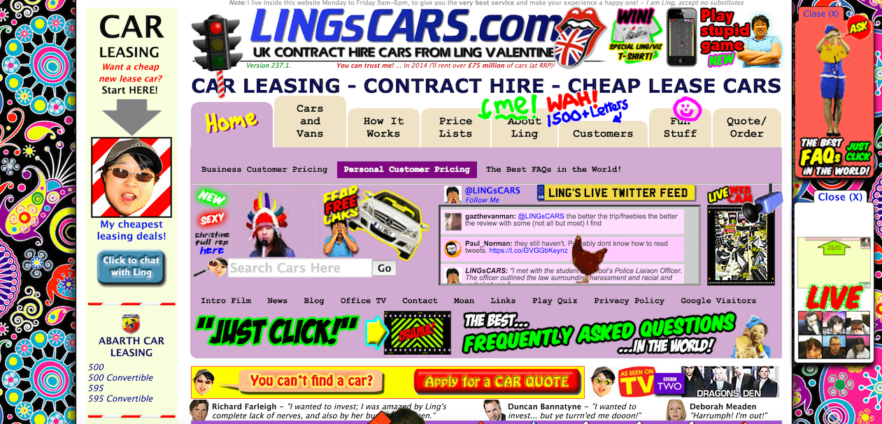
Too many auto-play videos, flash animations, and pop-ads work negatively for a website. These things occupy space and so do images. If it takes a long time to load an image then users mostly switch to other websites which is bad for the SEO of your website. Your website should not be cluttered with too many things in it. White space should be used wisely as it makes the content more attractive and readable. A messy website won’t be considered professional and will repel the customers.

Unclear Intention:
The purpose of your company should be represented with absolute clarity on your website. It should tell about the services and facilities your company renders as plainly as it can. A visitor to your website should know whether he/she will find what s/he is looking for. If the intention of your brand is not conveyed properly then no one will be interested in the website.
Badly Arranged Content:
Through content, the conversion rate can be increased. Content marketing is directly proportional to the improved SEO of a website. Your content should always be updated otherwise your website will appear inactive. If useful content and blogs are not updated regularly visitors will lose interest in your website. Good content should not have any typographical errors or grammatical mistakes. Always use clear fonts so that the content will be easy to read. Be clear in your content about the services you can provide instead of promoting your brand. Make sure that the backlinks are correctly linked and that there are no broken links. Avoid keyword stuffing for enhanced SEO.
Incompatible and Erroneous Pages:
Whenever a client wants to go to some page it must open and not lead him/her to an error page. Your website should be mobile-friendly as well. Those websites that work only on laptops or desktops are obsolete as now most people prefer mobile to these devices. Mobiles consume fewer data so people want things on their mobiles.
Absence of References:
People trust others’ experiences more than recommendations. You should always put the direct word of your clients about their experience with your website in the testimonial or reference section. It is a good way of letting people know who they will work with.
Absence of Contact Information:
A visitor should always find your contact details like phone number, email address, and location easily on your website. Instead of putting company details give descriptions about employees so that the customer will know who to contact.

Unpleasant Visual Engagement:
Your page should be attractive enough to attract traffic. Use colors that go well with your brand. Do not stuff your website with too many images, unpleasant background colors, or fonts.
Conclusion
If all the above-mentioned factors are present in your web design then your website will fail bitterly. It will jeopardize your website's credibility and make your website look old-fashioned. As a result, you will lose valuable customers.

Written by: Jitendra Raulo
Jitendra Raulo is the Founding Director at Aarav Infotech India Pvt. Ltd., a leading Web Design and Digital Marketing Company with 11+ years of experience and having headquarter in Mumbai, India, and Support Centre at Bhubaneswar, India, he is actively working with Start-ups, SMEs and Corporations utilizing technology to provide business transformation solution.


